Posts From Category: mobile

Mobile Design Workflow

The first thing we need to figure out is what we want to be able to do with our App.
Create a list with the features you want it to include.

Step 1: Design Patterns and Colour Palettes

Then we should have a look at design patterns and be inspired by them.

MobilePatterns Pttrns
This websites curate whole sections of app design based on particular themes. They’re a good place to start looking for to get inspiration for all your design needs.

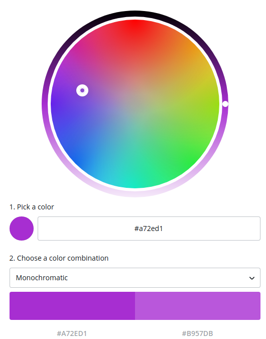
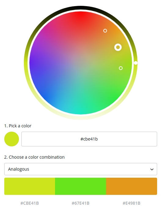
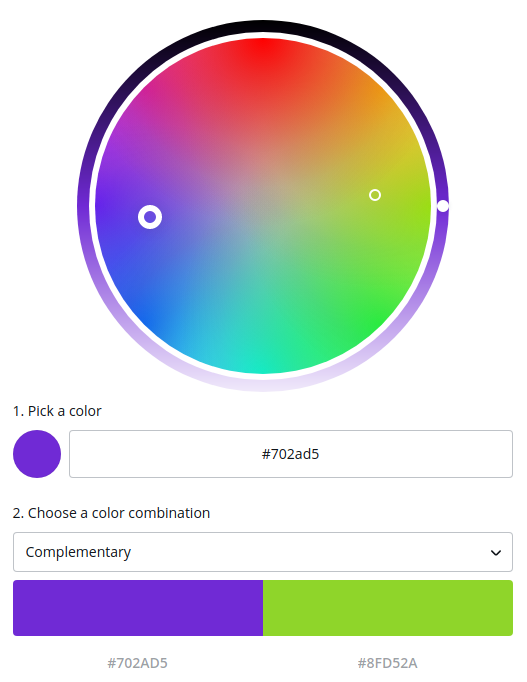
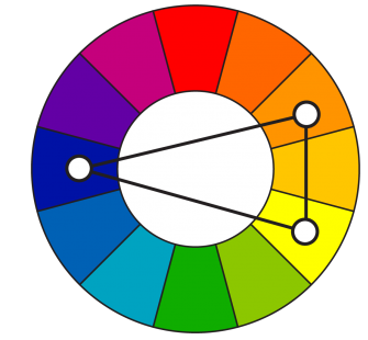
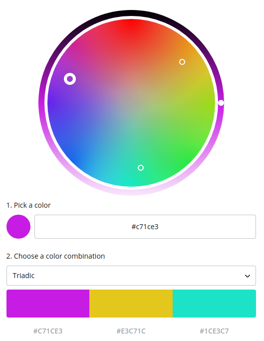
ColorHunt Flat UI Colors for iOS Palette Design for Android
The next step is to pick a color palette. It can be difficult to come out with colors that fit certain moods or colors that harmonize with each other. So use those websites.

Now that we have the color palette, and we roughly know how we want our user interface to be.

Step 2: Create a User Flow Diagram

It’s a very high level representation we use to design a user’s journey through your app or website. Always design from as basic as possible, the same change takes 3 seconds in design stage, 3 hours in photoshop or 3 days when programming.

Start from a user flow diagram until you get to a point where you’re happy with how your app (logically) functions before you commit yourself to miles of code. It will save you time.

There are three items in a user flow diagram:

  • Screens (represented as squares)
  • Decisions (represented as diamonds)
  • Actions (link between screens and decisions, represented as arrows)

For example, for the Amazon App you can:

  • decide to search for an item
  • have a look in your basket
  • go check out
  • browse through the list of suggested items

Step 3: Wireframing

Wireframes are a low fidelity representation of how your app will look in the future.
It’s just a very rough sketch or an outline of how your app would look. You draw where the images, navbars, buttons and controllers go.

It shouldn’t take more than 20 minutes to draw up 10 screens. It allows you to formulate your ideas into something tangible.

Now we take out the user flow diagram, we previously created, and we’re going to convert all of these screens (represented by rectangles) into wireframes.

Pop app allows you to create a wireframe, takes photos of the screens and simulate button’s behaviour so you get a virtual, working wireframe model.

UI Stencils’ Design Temapltes [Wireframe cc](https://wireframe.cc/)

Step 4: Mockups

A mockup is a high fidelity representation of your design. It’s like if you went into this app in the future, and you took some screenshots of it. It should look photo realistic and like the real thing.

Tools to create real life app mockups. Placeit
MagicMockups SmartMockups

Tool to design mockups.
Sketch. It allows you to create vector objects.
Canva
Marvel. Browser based app to create mockups and prototypes.
UXPin good but bad free tier. Paid on a monthly basis.
InvisionApp
Moqups

Step 5: Animated App Prototype

Prototypes are essentially animated versions of all your mockups. It will show how your app would look, work and animate in real life. It’s like you have the app in your hand and you’re using it. This involves no code!

Marvel. Browser based app to create mockups and prototypes. Working example
InVission Proto

Resources

Where to find free for commercial use image assets.
HD photographic images:
Resplashed
Pixabay

Vector images:
Vecteezy
Freepik

Free (with attribution) icons:
Flaticon
Material
Fontawesome

Read More

UX Design

You can and try to predict people’s behaviour as much as you can, but very often you have to be flexible and you have to tailor your designs.

None of the “good” design matters, if it obstructs people’s user experience. It’s important to get UX right, because there’s such an abundance of apps that unless users really enjoy using yours, they’re going to delete it the first time it’s installed.

Main questions:

  1. What is the user using my app for? What’s the core functionality?
  2. Am I doing it just because it’s good or because it’s clever?
  3. Am I being consistent?
  4. Can I make it simpler?
  5. Am I making life difficult for my users?
  6. Can I teach without teaching?
  7. Am I treating my users like dumbasses?

Usability

What is the user using my app for? What’s the core functionality?

Once you know what your users want to achieve with your app, then you should make the process of completing that action as friction free, or as few steps as possible. Then afterwards, you can think about asking them incrementally for more things.

Map a user’s journey through your app and think how can you minimize the steps that it takes for them to achieve the main goal. If you do one thing well, the rest is an added bonus.

Asking for permissions

UX is closely tied to psychology. A lot of times you’re trying to persuade users to take certain actions such as stay in the app for longer or make a purchase. We have light and dark patterns.

Ask the user for permissions or to agree to things step by step. Don’t do it all at once when he opens the App. Do it gradually as he gets used to the app or as he needs it.

User Profiling

The thing that you think your app might be about, might not be the thing that users value. You have to know who your users are and what they want to achieve using your app.

The best way to do this is by profiling your users and build a personality into your app by tailoring around your user profiles.

Form vs function

Am I doing it just because it’s good or because it’s clever? When you’re making choices between form vs functions, always go with function. Sometimes when you’re designing things it can be really easy to get lost in your own thoughts and ego.

Always get a second opinion.

Consistency

Be consistent with your brand, app and web. The’re needs to be consistency. A confused user is an unhappy user.

Think about consistency not just in terms of appearance, but also in terms of functionality. If you’re making a website for people to submit their IT problem, don’t make it look like it’s an e-commerce site.

Understand what your product does. What your branding is. What your company is all about.

Simplicity

Can I make it simpler? You should always keep in mind to keep things as simple as possible.

Never ever implement two rows packed of buttons. Don’t do long tutorials of things that should be pretty much intuitive from the go. You don’t have to explicitly tell people about this kind of things. It can feel really condescending.

You have to identify the core objective of the users for using your app and then try to minimize the number of steps that it takes to achieve that. Scrap everything until you’re left with the very basic and then add features and things on top of it as users demand it.

Don’t make me think

Am I making life difficult for my users? We should try and minimize our toll on the user’s brain. Try to make the interface as clear and as least confusing as possible for our users.

When password rules get too complicated and you overload a user’s brain making them think that this is way too much effort, you’ll see your sign-ups drop off. There’s a happy medium between keeping that password secure and encouraging your users to sign up.

Don’t put annoying tutorials from the get go. Give your users tidbits of information instead. Make it contextual. Relevant to the tasks at hand. Show somebody something just as and when they need it. This is how you want to teach users to use your app. Don’t overload their brain with loads of information at the beginning (front loading).

Try to make your wording as clear as possible.

When something’s so ingrained such as pinch to zoom, you cannot try and map that on to something else. It will cause confusion and you will loose users.

Onboarding

You don’t need to make everything so explicit. To use Flipboard you need to swipe up. If after a few seconds the user didn’t interact with the screen, the bottom of the screen will peek up. With this little tiny interaction, the user has learned to interact with your app without any tutorial. Try to teach without teaching.

Idiot Boxes

Interrupt your users’ flow as little as possible or you’d prevent them from having a good user experience. Don’t force pup-ups to confirm actions. Interrupting a user’s flow for no good reason is stopping the proceedings with idiocy.

Read More

UI Design

Design is meant to give the user conscious and subconscious clues as to how you should be able to interact with the digital world. If an App was a Journey, you’re the tourguide. Don’t throw all information to your user’s face and hope he learns.

  1. (edge) align everything with everything else.
  2. buttons should look clickable. They need an icon or a hint to visually show what it does.
  3. start with a monochrome design and color it up, color by color.

The importance of Alignment

Alignment is key in any sort of graphical design. Align everything with everything else.
A fundamental principal is you want to try and minimize the number of alignment lines. This is something low effort, but makes a huge amount of difference.

There are two fundamental types of alignment.

  • edge alignment you have all the elements having one side lining up with a single vertical or horizontal line.
  • center alignment you line up all the elements by their midpoint.

In terms of user interface design, edge alignment is what we want. Take a screenshot of your interface and draw all the item’s edge lines you find. You want to have as few as possible by aligning everything.
Having a lot of lines looks messy and uncoordinated. Having fewer lines results in a cleaner design that looks more pleasing to the eye.

Colour in User Interface design

I can’t stress this enough, keep it as simple as you can to start with. When creating a web or an App, start with a completely monochrome design. This way you focus on the layout, alignment and making things look good by position without being distracted by flashy colors, images or fancy stuff.

Then give it a single shot of color to highlight key things you want to draw people’s attention to. If everything is black and white, even a hint of color will stand out in a big way. Then maybe add two colors or three and go up from there.

Use Dribbble to search by color and see how different designers combined that particular color.

Make Text Visible on Images

When a text overlays with an image, specially if the image changes and the text does not, you have to be sure there’s enough contrast so the text is always readable.

The easiest option is use a high opacity background just for the text. This makes the text stand out from the background image.

Another option is to apply an overlay to the image with a f.e. 20% opacity. This overlay stands between the image and your text.

If you know that your text is going to be placed in a fixed position relative to the image put a gradient overlay which starts at 0% at the middle of the image, and becomes more and more opaque the further you go.

Read More

Typography

Serif and Sans Serif are the biggest two family fonts. Usually people use Serif for serious things such as law letters.

Serif is further divided into:

  • Old Style. The oldest Serif typeface family. Very conservative, very old looking.
  • Transitional. Slightly more modern looking. New York Times.
  • Modern. Vogue magazine. Incredibly modern yet classy.
  • Slab. It was created for newspaper printing.

Sans-Serif don’t have that tiny little feet or decorative elements that Serif has. They look more modern and are further subdivided in four families

  • Grotesque
  • Neo-Grotesque
  • Humanist
  • Geometric

Read More

Colour Theory

Colour Moods

  • red love. energy. intensity - used for ads related to excitment or love.
  • yellow joy. intellect. attention - used for attention grabbing purposes such as icon design or screenshots, so it grabs the user’s attention when scrolling down. If you have an app with this background colour, people won’t be able to stare at it for very long.
  • green freshness. safety. growth - used for food
  • blue stability. trust. serenity - medical, medicine, health. Used when you have a design that needs people to have faith and trust in you.
  • purple royalty. wealth. feminity.

How to combine colours

It’s rare to have just 1 colour. There’re predominant and subsidiary colours.

Monochromatic

Very modern. Take various tones and shades of the same colour.
They work really well for modern digital design.

monochromatic-colour-image

Analogous colours

If you want to have an easy palette, select one colour and take the analogous colour in the colour palette. This creates designs that are incredibly harmonius and easy to look at.

This is something to think about when you’re designing app-background-screens or the main interface.

analogous-colour-image

Complementary colours

The opposite of analogous colours. This is when you select one colour and take the opposite one in the colour palette.

This creates extremely classy designs that stand out to grab your attention. They can be good for logo design or attention grabbing screenshots, but they don’t make very good colour palettes for your main interface.

You don’t want to be staring at clashing colours all the time.

complementary-colour-image

Split colours

You can tone your flashiness down using split colouts. By having a three colour paletter you end up with designs that are still attention grabbing but are easier to look at.

Use them for app icon design, as it’s going to be mostly shapes and colours. They allow the app icon to stand out without being flashy.

split-colour-image

Triadic Colours

They tend to be quite well balanced and yet still attention grabbing. They look very 90s as they were pretty much overused then.

triadic-colour-image

Tools

MaterialPalette
ColorHunt
FlatUIColors
Colorzilla
Color picker

Read More