Colour Moods
redlove. energy. intensity - used for ads related to excitment or love.yellowjoy. intellect. attention - used for attention grabbing purposes such as icon design or screenshots, so it grabs the user’s attention when scrolling down. If you have an app with this background colour, people won’t be able to stare at it for very long.greenfreshness. safety. growth - used for foodbluestability. trust. serenity - medical, medicine, health. Used when you have a design that needs people to have faith and trust in you.purpleroyalty. wealth. feminity.
How to combine colours
It’s rare to have just 1 colour. There’re predominant and subsidiary colours.
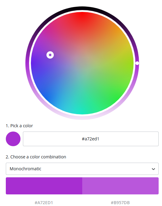
Monochromatic
Very modern. Take various tones and shades of the same colour.
They work really well for modern digital design.
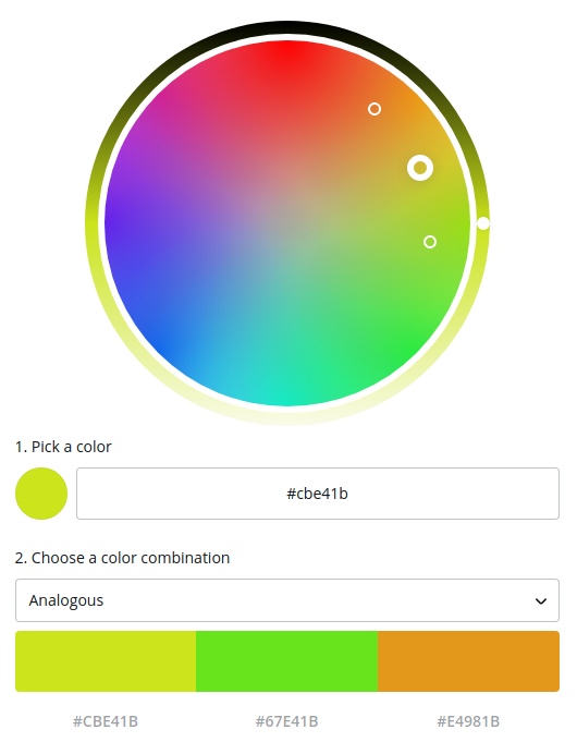
Analogous colours
If you want to have an easy palette, select one colour and take the analogous colour in the colour palette. This creates designs that are incredibly harmonius and easy to look at.
This is something to think about when you’re designing app-background-screens or the main interface.
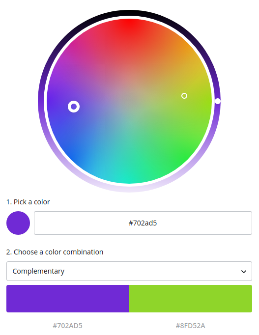
Complementary colours
The opposite of analogous colours. This is when you select one colour and take the opposite one in the colour palette.
This creates extremely classy designs that stand out to grab your attention. They can be good for logo design or attention grabbing screenshots, but they don’t make very good colour palettes for your main interface.
You don’t want to be staring at clashing colours all the time.
Split colours
You can tone your flashiness down using split colouts. By having a three colour paletter you end up with designs that are still attention grabbing but are easier to look at.
Use them for app icon design, as it’s going to be mostly shapes and colours. They allow the app icon to stand out without being flashy.
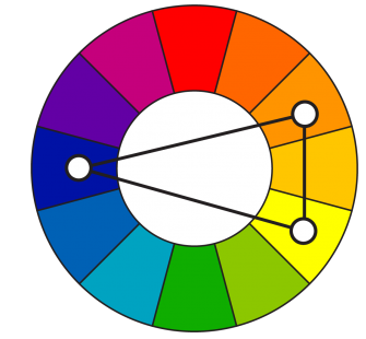
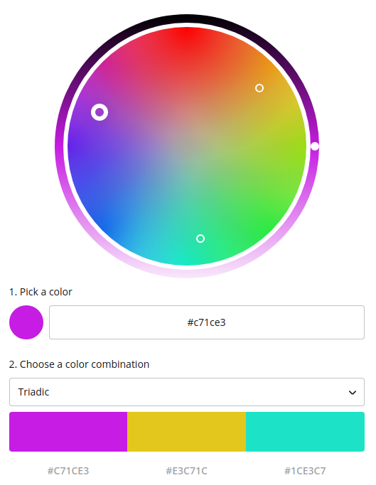
Triadic Colours
They tend to be quite well balanced and yet still attention grabbing. They look very 90s as they were pretty much overused then.
Tools
MaterialPalette
ColorHunt
FlatUIColors
Colorzilla
Color picker